At its core, Tinybird is a platform for developer productivity. Starting today, we’re releasing an updated UI experience to help you:
- Access and explore Data Sources more easily
- Improve your focus as you build Pipes
- Reduce the number of clicks to navigate the UI
Here’s a little more detail on the new release.
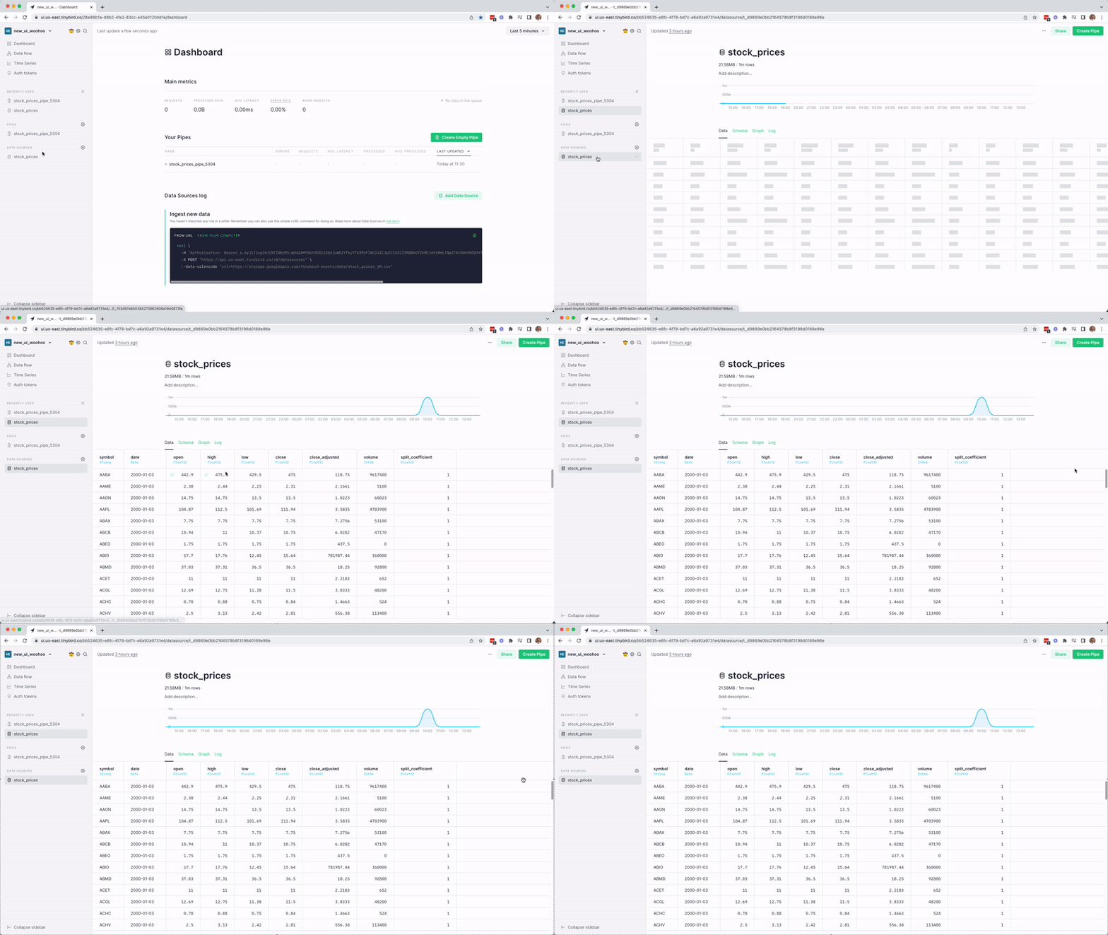
More space to view Data Sources
Until now, the only way you could view a Data Source in the Tinybird UI was with a small pop-up modal. We felt like this restricted your view of the Data Source. The new look gives you a cleaner and more functional interface that highlights your data with less distraction.
We’ve removed the modal and now give you the full content width to examine your Data Source, making this experience consistent with how you interact with the rest of the Tinybird UI.

This declutters the workspace and gives you more room to explore the Data Source, with a better view of the ingestion chart to help you validate ingestion and spot problems more quickly.
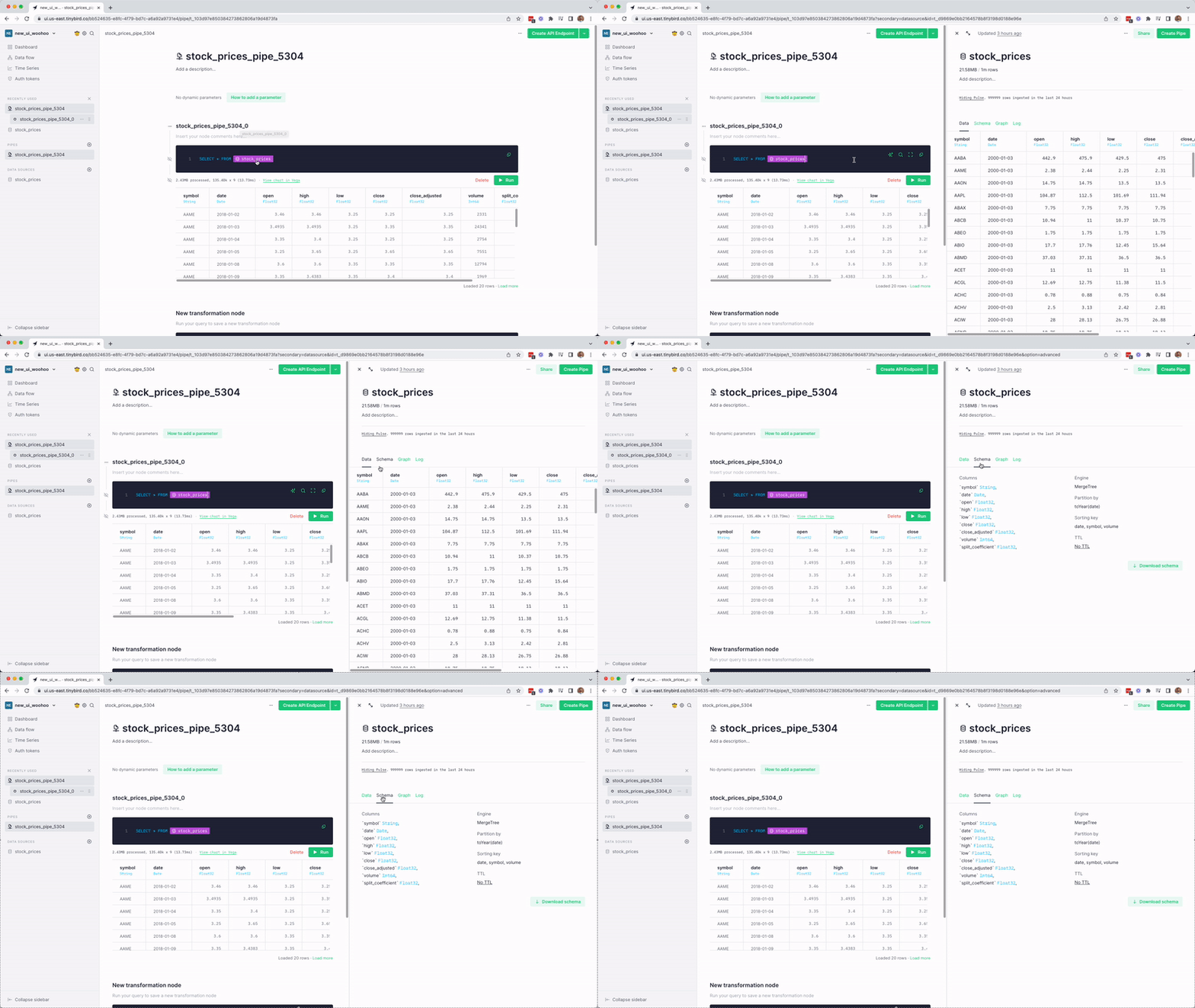
Build Pipes without context switching
Prior to this release, you couldn’t easily view a Data Source while creating a Pipe unless you navigated back to the Data Source modal or created a SELECT * FROM datasource node.
We’ve introduced a new split-screen functionality that lets you review the schema of a Data Source while you're working on a Pipe that queries it. Simply click on the Data Source label in the Pipe SQL, and you’ll have access to the Data Source, its schema, and more without leaving the Pipe editor.

Navigate Data Sources more easily
We have also reorganized the Data Source menu - the list of items underneath the ingestion chart - by simplifying and renaming the tabs. We believe this change makes them easier for you to scan and navigate Data Source settings.
These are the new tabs in the Data Source menu:
- Data (view your data coming in)
- Schema (see the structure of your Data Source)
- Graph (see the dependencies between your Data Sources and Pipes)
- Log (observe what happened)

Maybe you hadn’t given much thought to the Data Source menu, but given how often Tinybird users interact with it, we decided that these small improvements would carry big benefits.
See the Data Source structure with the Schema tab
As a part of the Data Source menu upgrade, we’ve added a dedicated schema tab, where you can see the Data Source schema just as it is reflected in the .datasource files that you use in the CLI. From this tab, you can download the schema to view or edit in the CLI, and you can also update the Data Source TTL.
Easily copy values from a table
We’ve added a copy button that appears when you hover over any cell in a Data Source or Pipe results table. This makes it much easier for you to copy and paste values from a data table without having to hover, click, and drag the cursor precisely.

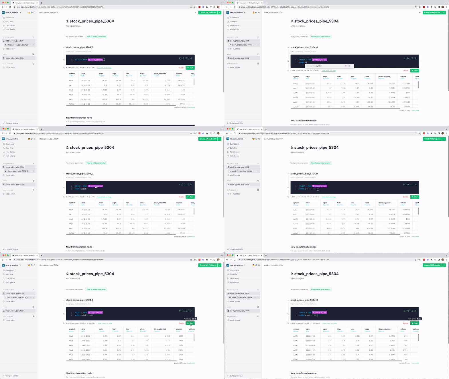
This can be especially useful if you want to test a certain filter in a Pipe or add a default value to a query parameter. Just click and paste.
Explore the new look
As of today, these new UI features are enabled for all Tinybird users. We hope these new features will make your work simpler, more delightful, and more productive.
Start exploring today at app.tinybird.co, and let us know what you think.
Have feedback?
Do you have ideas for how we can improve Tinybird? Most new features like these start as ideas (or complaints 😉) offered by Tinybird users. Drop us a note in Slack or tweet at @tinybirdco to share yours.

